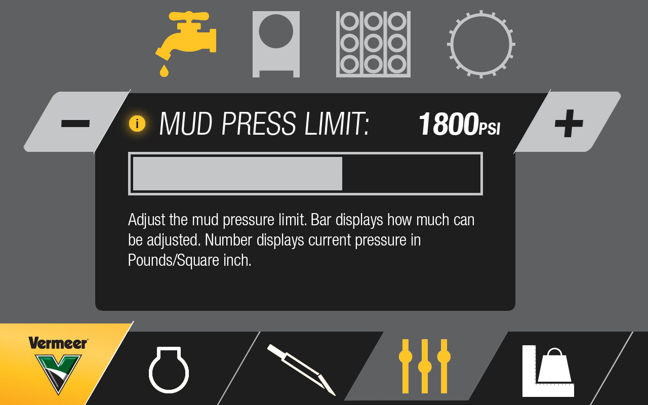
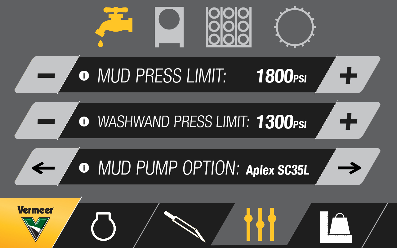
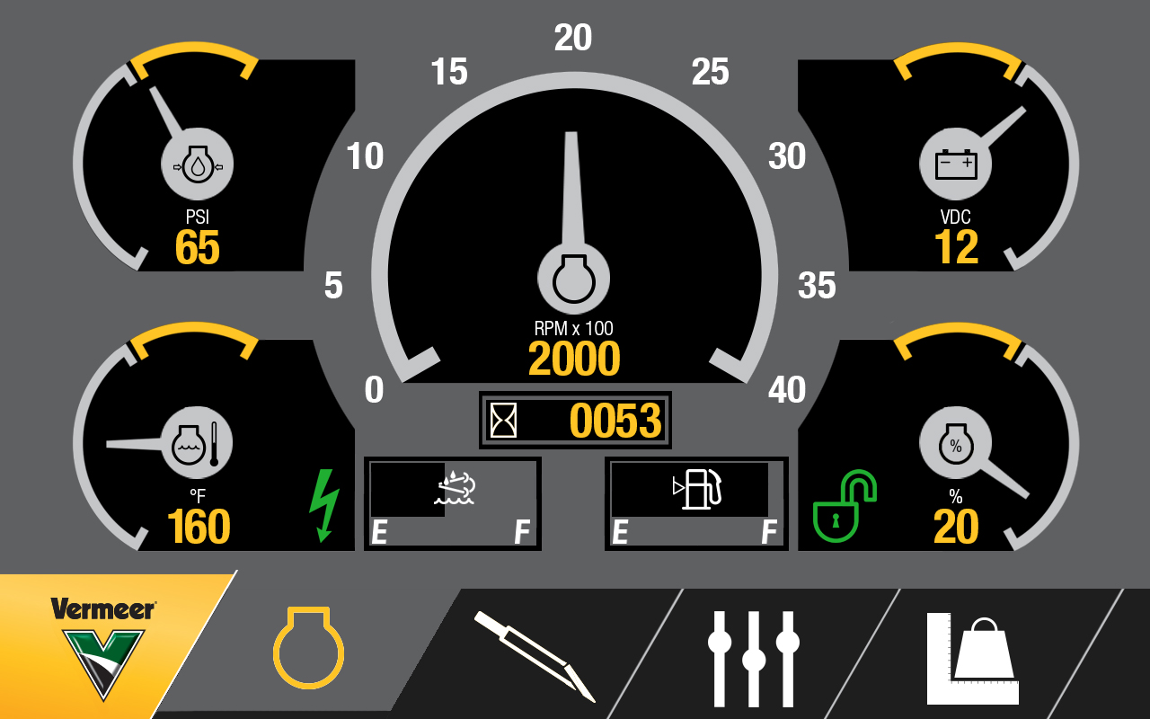
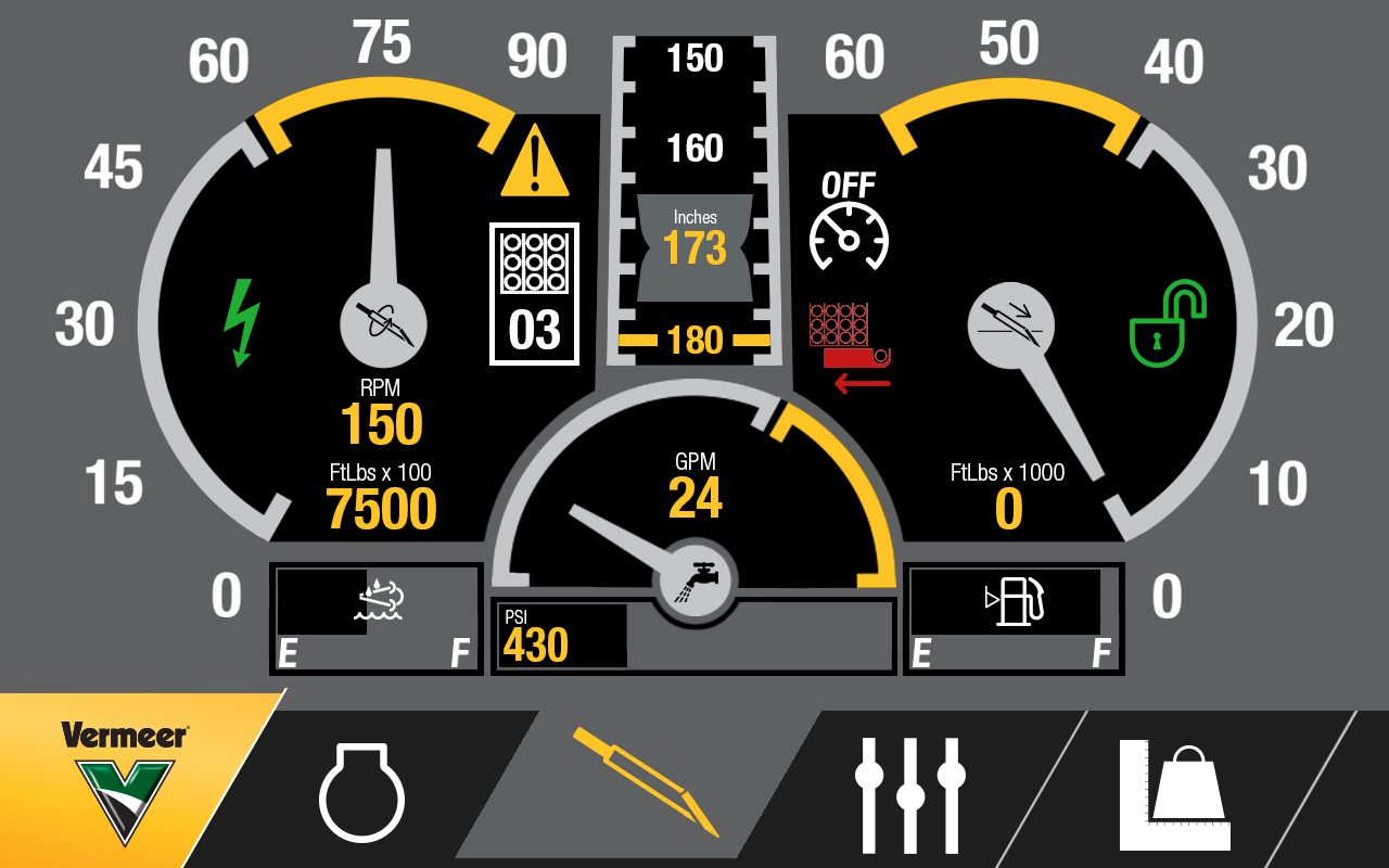
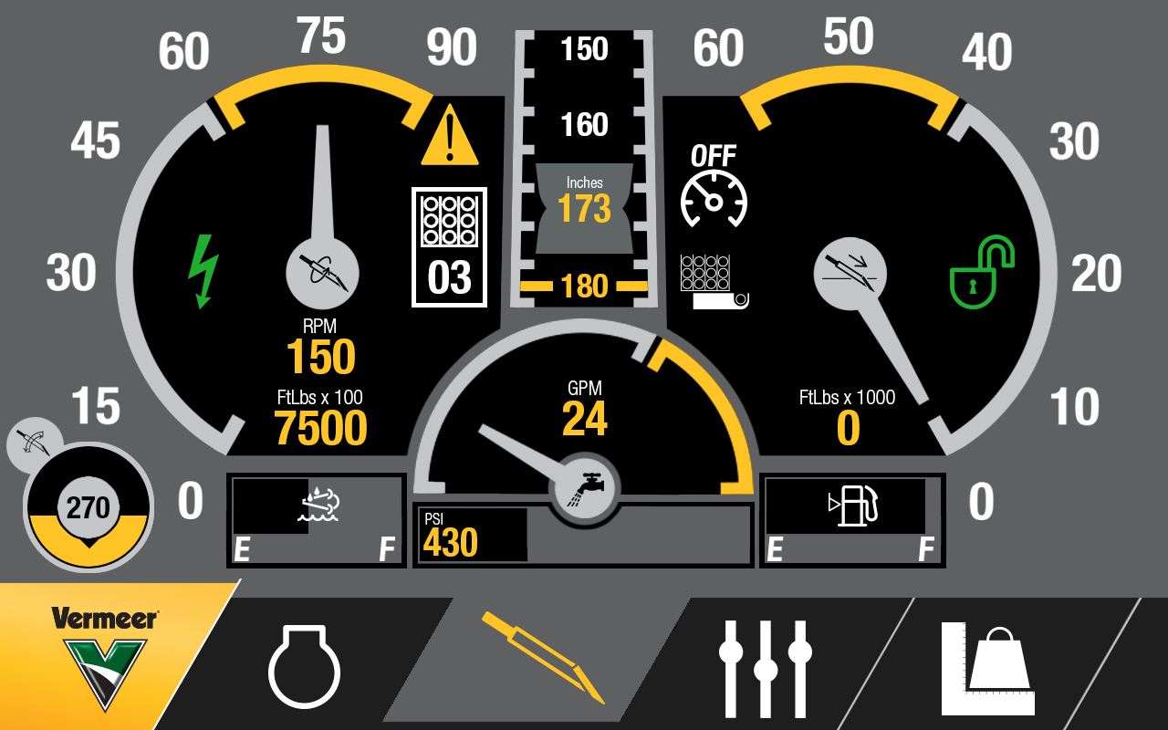
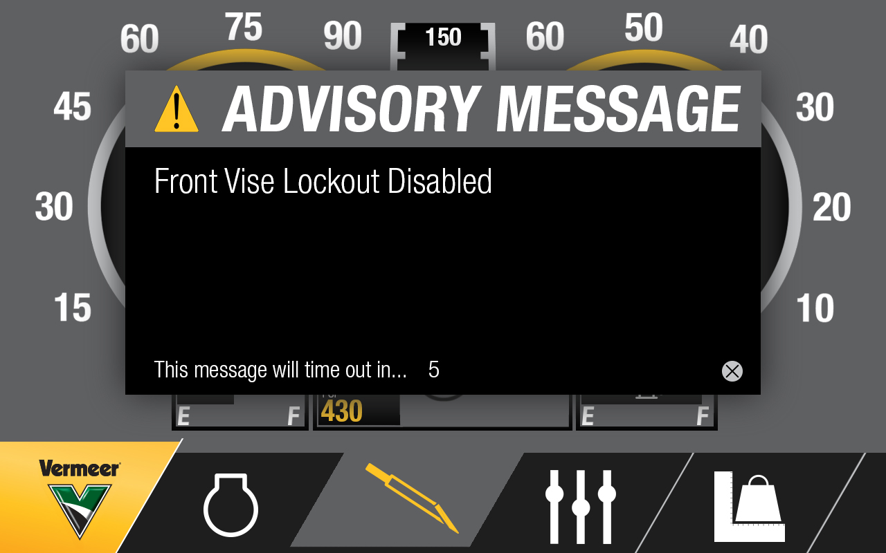
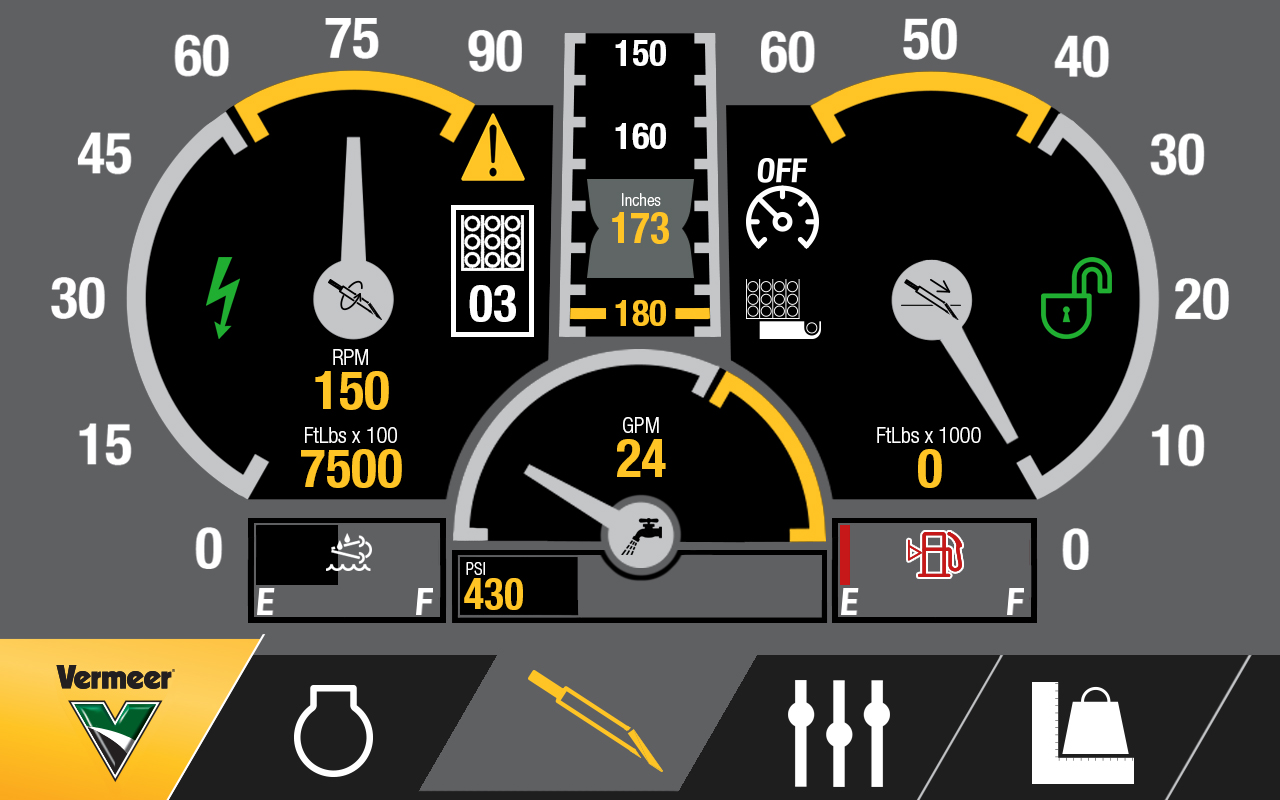
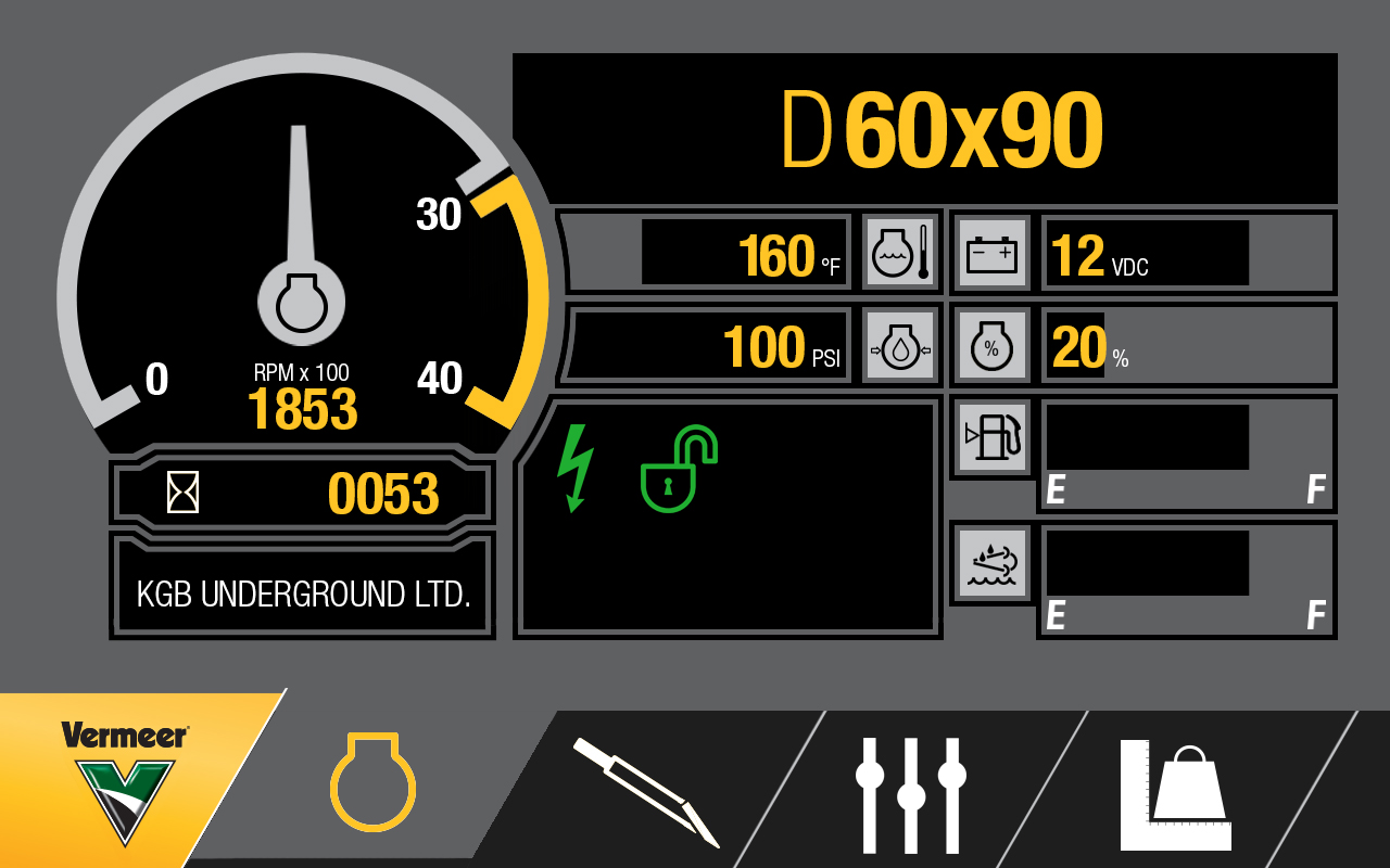
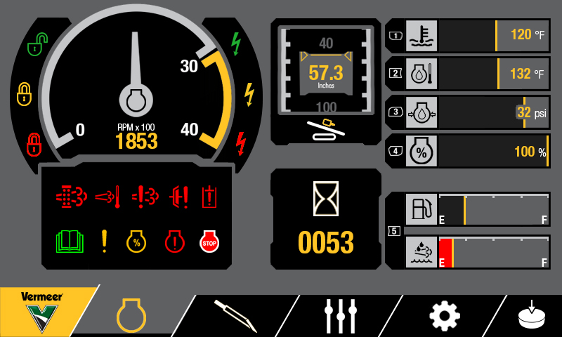
Redesigned Machine UI

The original UI created for the previous generation of machines was extremely utilitarian. Not much attention had been paid to contrast or visual clarity. I was tasked with overhauling the design ethos for the next generation of machines as they would each be equipped with a much more powerful screen. Looking at what our operators are used to, I looked at the automotive industry and took inspiration from pickup truck dash boards to drive the initial concepts. Using a mostly flat, but slightly skeuomorphic design language helps convey to the operator at a glance what value is what and lets them quickly pick out the information they need.